Sankey charts
Sankey charts are used to visualize the flow of cash in a company.
The plot_sankey_chart function will plot a Sankey chart based on data extracted from the Yahoo Finance API.
Below is an example of how to plot a Sankey chart for AAPL stock:
from stockdex import Ticker

ticker = Ticker(ticker="AAPL")

ticker.plot_sankey_chart()
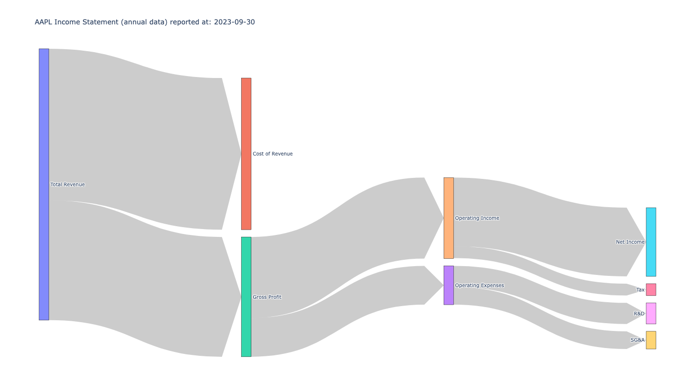
The output of the function is a Sankey chart showing the income statement of the company.
Hovering over the chart will show the amount of cash in each category.
Below is the output for AAPL stock based on annual data: