Building dashboards with multiple plots
In previous sections, we have seen how to use the functions with the plot_ prefix to create single plots.
There might be cases where you want to create a dashboard with multiple plots.
Below is an example of how to use these functions to create a dashboard with multiple plots using the dash library.
from stockdex.ticker import Ticker
from stockdex.lib import plot_multiple_categories
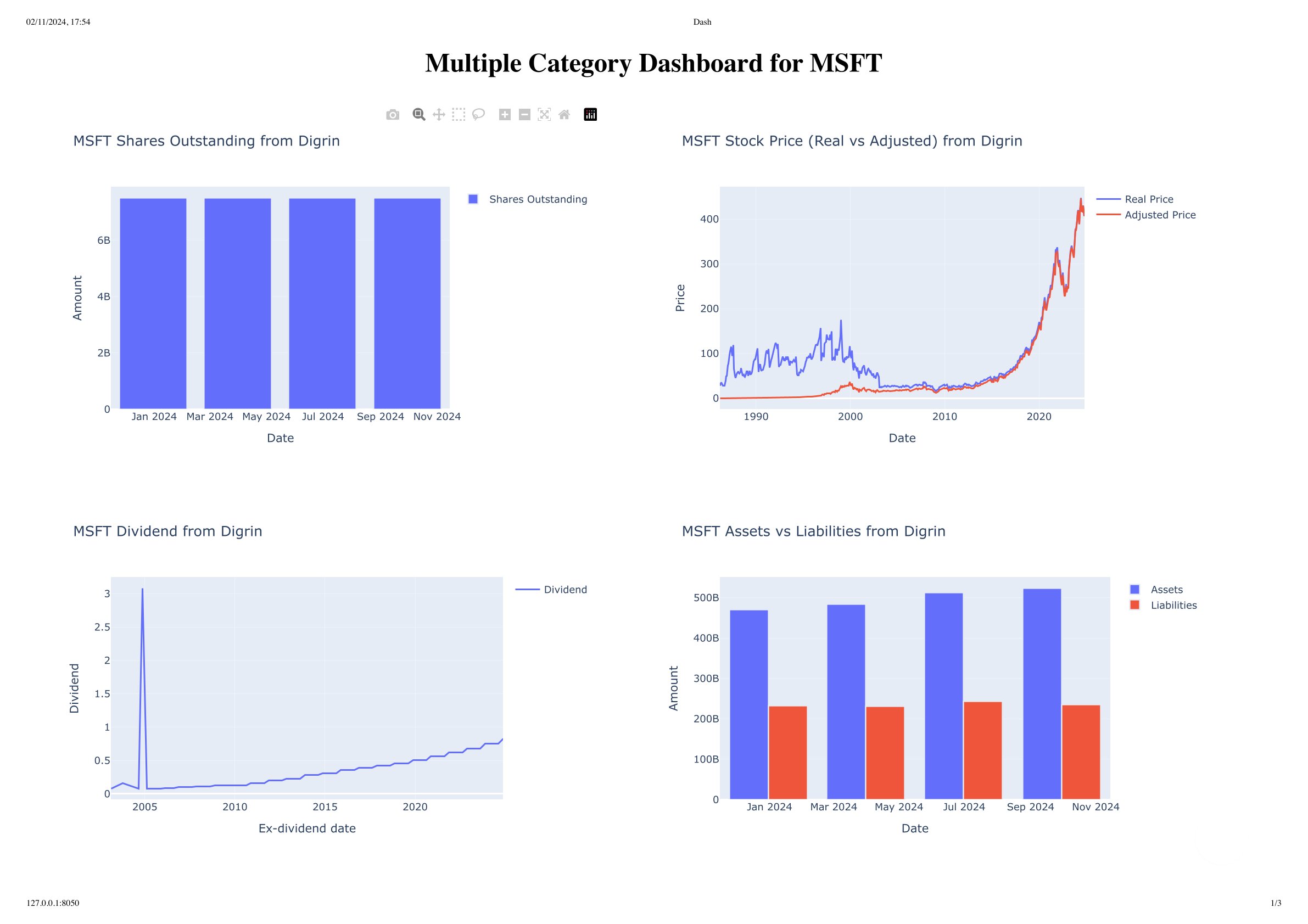
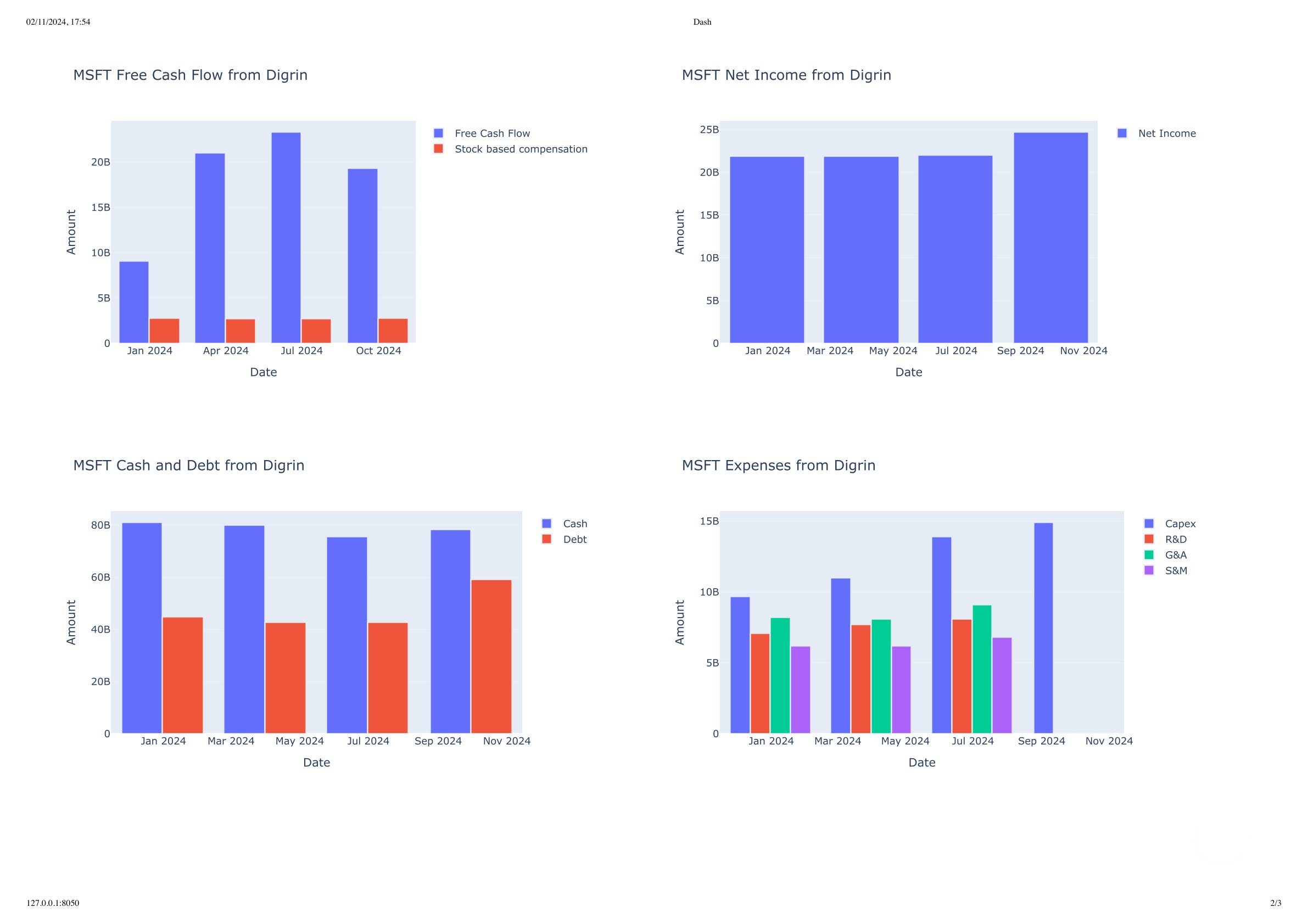
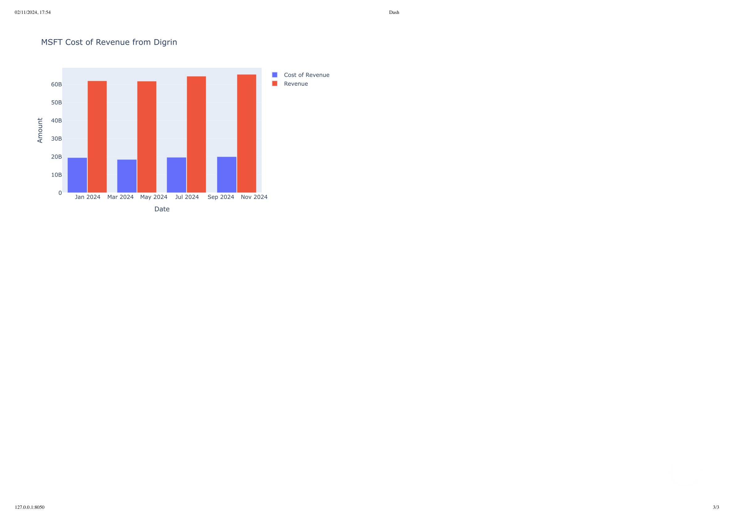
ticker = Ticker(ticker="MSFT")
# Here you will choose arbitrary figures to plot. In this example we will plot data extracted from digrin website
# IMPORTANT: make sure to set show_plot=False in each function to return the plotly figure object instead of showing the plot.
# Not setting this parameter will show the plots in separate tabs.
figures = [
ticker.plot_digrin_shares_outstanding(show_plot=False),
ticker.plot_digrin_price(show_plot=False),
ticker.plot_digrin_dividend(show_plot=False),
ticker.plot_digrin_assets_vs_liabilities(show_plot=False),
ticker.plot_digrin_free_cash_flow(show_plot=False),
ticker.plot_digrin_net_income(show_plot=False),
ticker.plot_digrin_cash_and_debt(show_plot=False),
ticker.plot_digrin_expenses(show_plot=False),
ticker.plot_digrin_cost_of_revenue(show_plot=False),
]
# main function that will create the dash app
plot_multiple_categories(ticker=ticker.ticker, figures=figures)
The output of the above code will be a dashboard available at http://127.0.0.1:8050/ by default.
The dashboard will have multiple plots showing the data extracted from the Digrin website.
Below is the output of the dashboard:
Results Example: MSFT dashboard