Digrin Plots
This section contains interactive plotting functions that visualize financial data scraped from Digrin.com. These plots focus on key financial metrics including shares outstanding, dividend tracking, price analysis, cash flow, and asset-liability comparisons with time-series visualization.
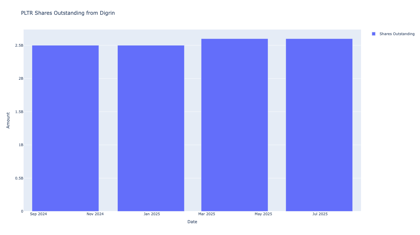
Number of Shares Outstanding Chart
Creates an interactive line chart showing the number of shares outstanding over time.
- Input Parameters:
show_plot(bool, optional): Whether to display the plot. Default is True.
Returns: Plotly line or bar chart object (px.line or px.bar).
from stockdex.ticker import Ticker

ticker = Ticker(ticker="PLTR")
result = ticker.plot_digrin_shares_outstanding()
Results:
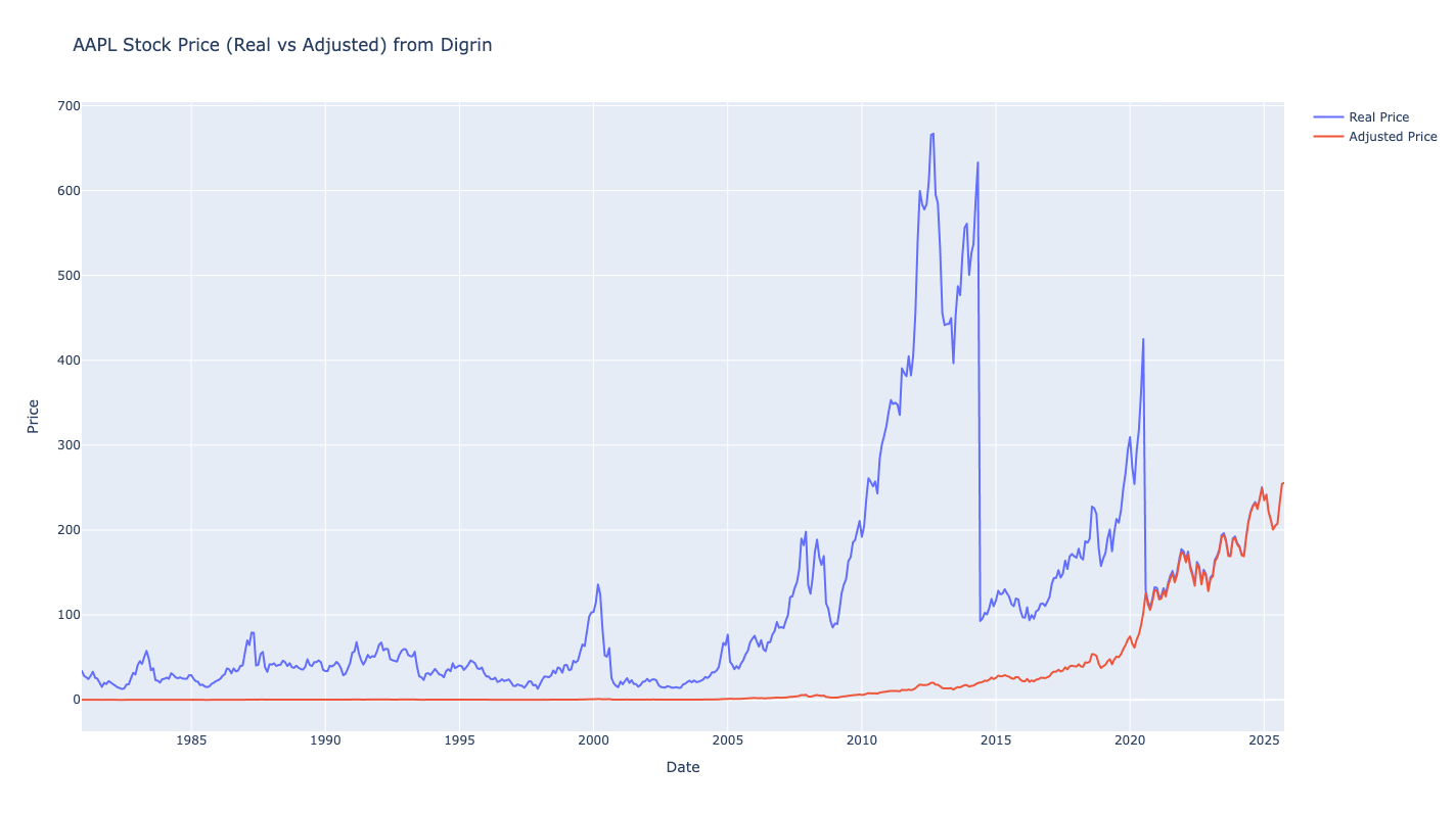
Price Chart
Creates an interactive chart displaying stock price movements over time.
- Input Parameters:
show_plot(bool, optional): Whether to display the plot. Default is True.
Returns: Plotly line or bar chart object (px.line or px.bar).
from stockdex.ticker import Ticker

ticker = Ticker(ticker="AAPL")
result = ticker.plot_digrin_price()
Results:
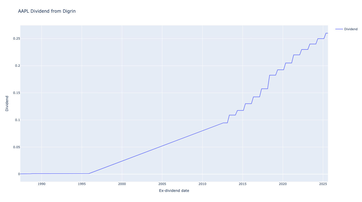
Dividend Chart
Creates an interactive chart showing dividend payments and trends over time.
- Input Parameters:
show_plot(bool, optional): Whether to display the plot. Default is True.
Returns: Plotly line or bar chart object (px.line or px.bar).
from stockdex.ticker import Ticker

ticker = Ticker(ticker="AAPL")
result = ticker.plot_digrin_dividend()
Results:
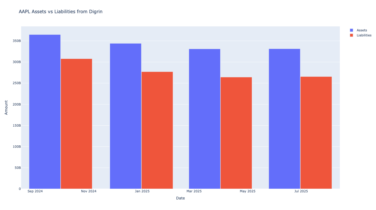
Assets vs Liabilities Chart
Creates an interactive chart comparing total assets versus total liabilities over time.
- Input Parameters:
show_plot(bool, optional): Whether to display the plot. Default is True.
Returns: Plotly line or bar chart object (px.line or px.bar).
from stockdex.ticker import Ticker

ticker = Ticker(ticker="AAPL")
result = ticker.plot_digrin_assets_vs_liabilities()
Results:
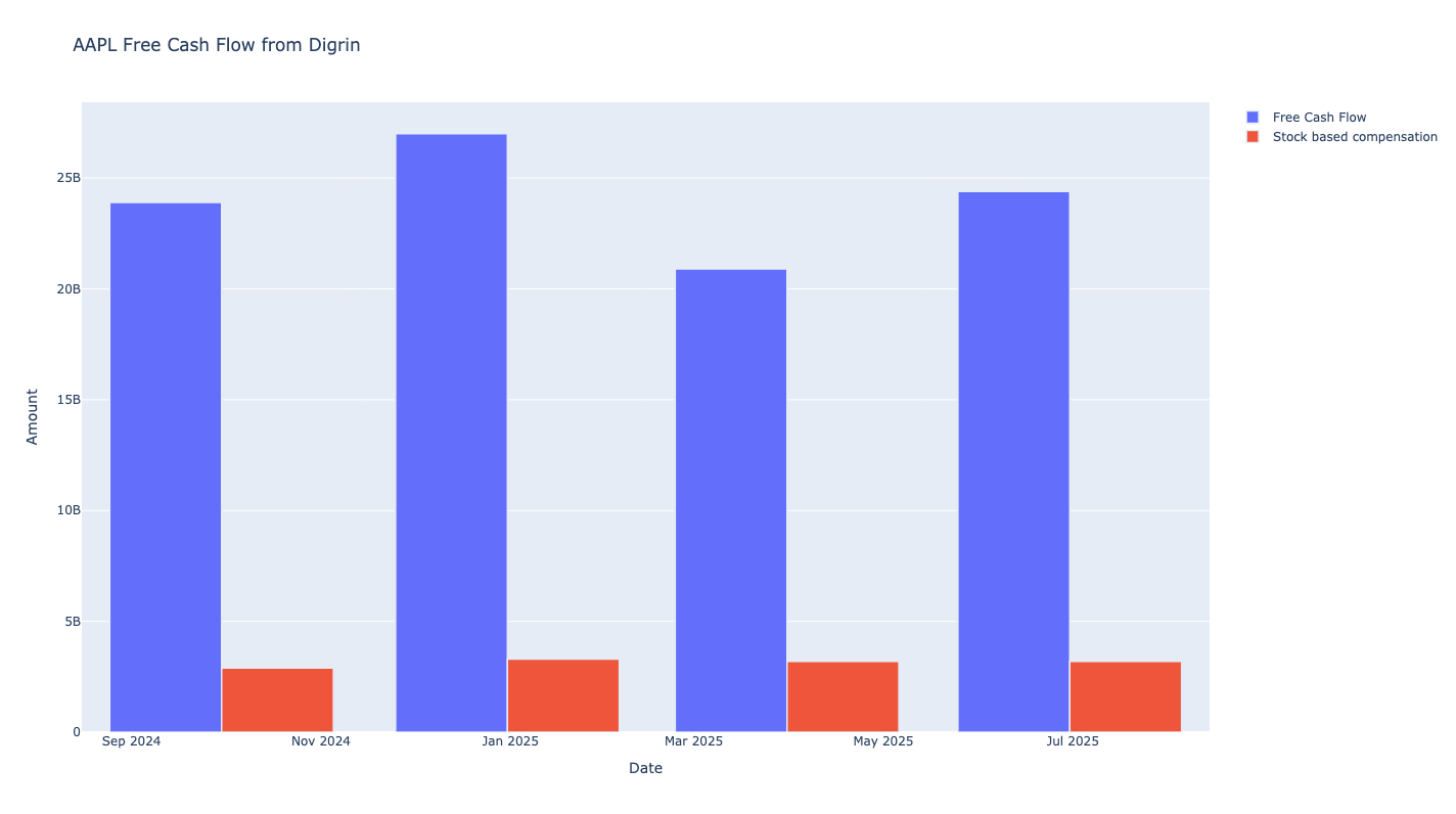
Free Cash Flow Chart
Creates an interactive chart displaying free cash flow trends over time.
- Input Parameters:
show_plot(bool, optional): Whether to display the plot. Default is True.
Returns: Plotly line or bar chart object (px.line or px.bar).
from stockdex.ticker import Ticker

ticker = Ticker(ticker="AAPL")
result = ticker.plot_digrin_free_cash_flow()
Results:
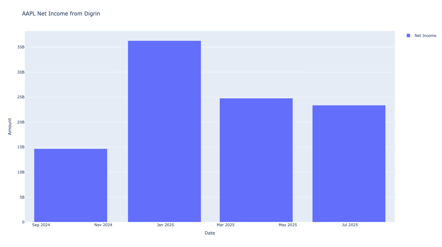
Net Income Chart
Creates an interactive chart showing net income trends and profitability over time.
- Input Parameters:
show_plot(bool, optional): Whether to display the plot. Default is True.
Returns: Plotly line or bar chart object (px.line or px.bar).
from stockdex.ticker import Ticker

ticker = Ticker(ticker="AAPL")
result = ticker.plot_digrin_net_income()
Results:
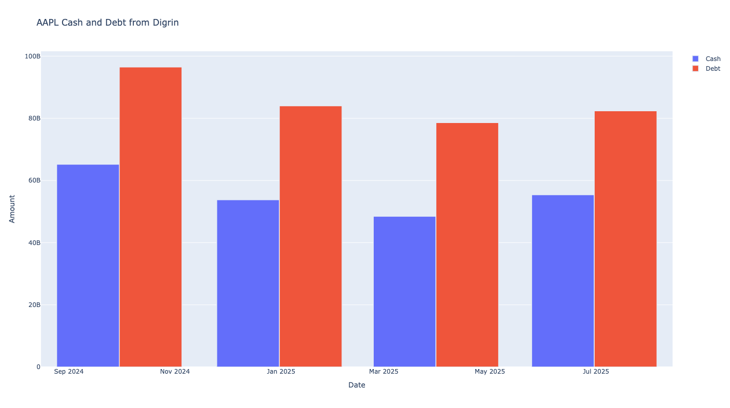
Debt vs Cash Chart
Creates an interactive chart comparing debt levels against cash holdings over time.
- Input Parameters:
show_plot(bool, optional): Whether to display the plot. Default is True.
Returns: Plotly line or bar chart object (px.line or px.bar).
from stockdex.ticker import Ticker

ticker = Ticker(ticker="AAPL")
result = ticker.plot_digrin_cash_and_debt()
Results:
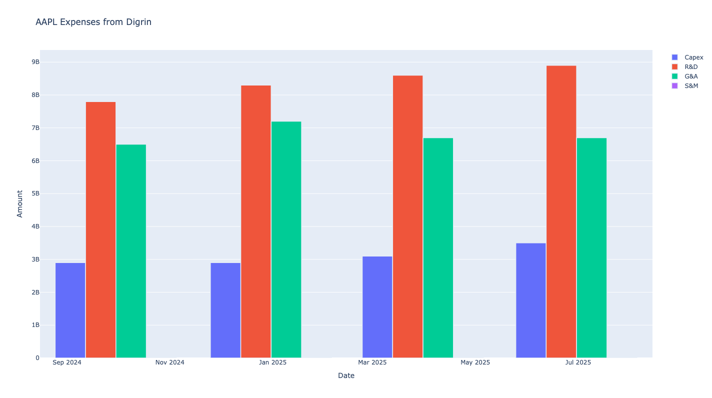
Expenses Chart
Creates an interactive chart displaying various expense categories and trends over time.
- Input Parameters:
show_plot(bool, optional): Whether to display the plot. Default is True.
Returns: Plotly line or bar chart object (px.line or px.bar).
from stockdex.ticker import Ticker

ticker = Ticker(ticker="AAPL")
result = ticker.plot_digrin_expenses()
Results:
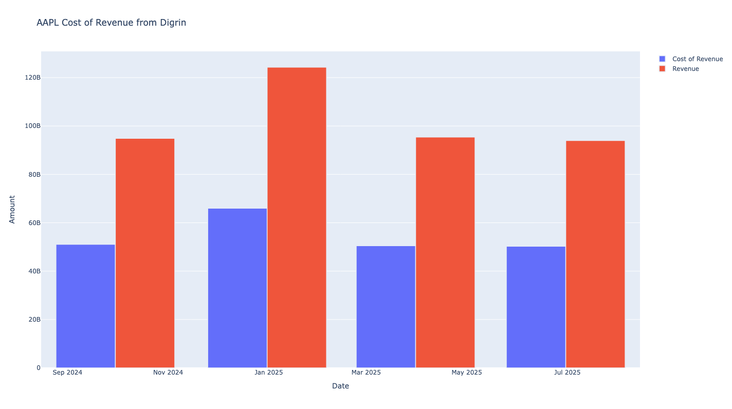
Cost of Revenue Chart
Creates an interactive chart showing cost of revenue trends and efficiency metrics over time.
- Input Parameters:
show_plot(bool, optional): Whether to display the plot. Default is True.
Returns: Plotly line or bar chart object (px.line or px.bar).
from stockdex.ticker import Ticker

ticker = Ticker(ticker="AAPL")
result = ticker.plot_digrin_cost_of_revenue()
Results: